

Air Matters
Note: This project is my master project. The final process book has about 160 pages and the presentation here only shows a small portition of it. If you are interested to see the entire process book, feel free to drop me a message.
Project Team: Binjie Sun, Kevin Shankwiler (Advisor), Wendell Wilson(Review committee), Tim Purdy (Review committee)
My Role: User Research, Market Research, Product/Interaction Design, Prototyping, Usability Test, Data Analysis
Tools: Illustrator, Photoshop, Indesign, Arduino, Foam Model
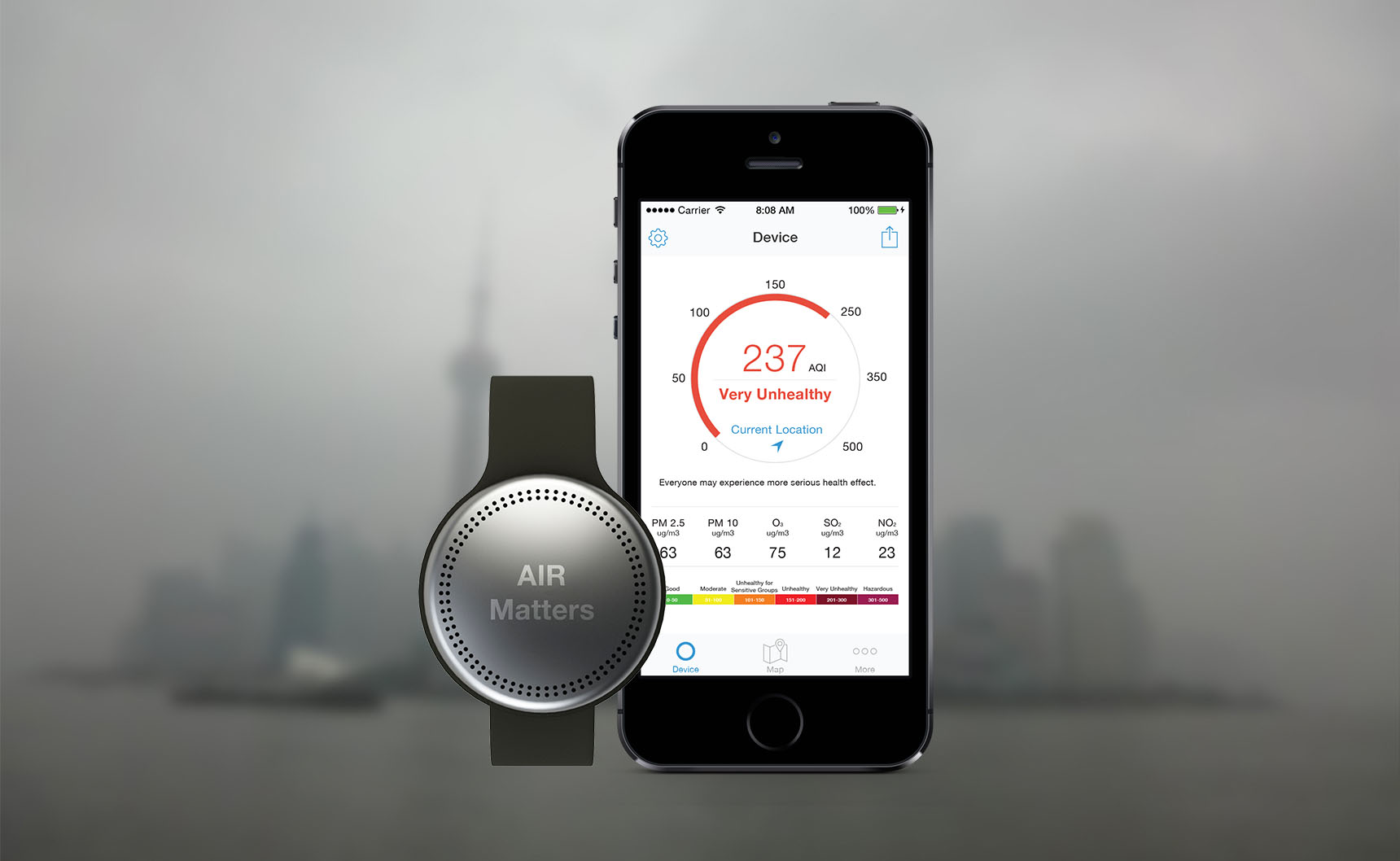
Air Matters is a project that empowers people with data, primarily by mapping particle matter level in the air and building a sensor network, enables people to contribute and freely use the data collected. It is a wearable device that people can carry around with them during daily activities. The device automatically detects air quality in surrounding environment in real time and alert the user if air pollution exceeds the safety threshold. With users’ permission, all the data sensed and collected by the device will be uploaded to the cloud via a smartphone app and then visualized into an air quality map to be used by the public.

Motivation
My personal experience of air quality in Atlanta and Shanghai drove me to explore more about air quality issues in China and do something about it with research and design.
Atlanta
I’ve been studying for my master degree in Atlanta for almost three years until 2014. The environment here is usually good. Blue sky, clean air and a lot of green spaces. This picture was a typical shot of midtown Atlanta in sunny weather.
Shanghai
At the beginning of 2014, I went back to China for Spring Festival. Before I was back, I’ve heard from my family and friends that the air quality in our hometown area is bad, especially in the winter. The smog was much more serious than before. I remember when my flight landed at Pudong International Airport, Shanghai, I couldn’t believe what I saw when looking outside the window. I can barely see things beyond 50 meters (~55 yards). That feeling was weird. On the way back home, my mom told me the smog happened 2-3 times a week in that winter. About a week later, I went back to Shanghai to visit the Shanghai Financial World Center which was the tallest building in Shanghai at that time. I took the picture when I was at the top of the building birds viewing the east side of the city. It's shocking that what’s shown in the picture is a typical day in Shanghai during winter, 2013. This experience of air quality in Atlanta and Shanghai drove me to explore more about air quality issues in China.
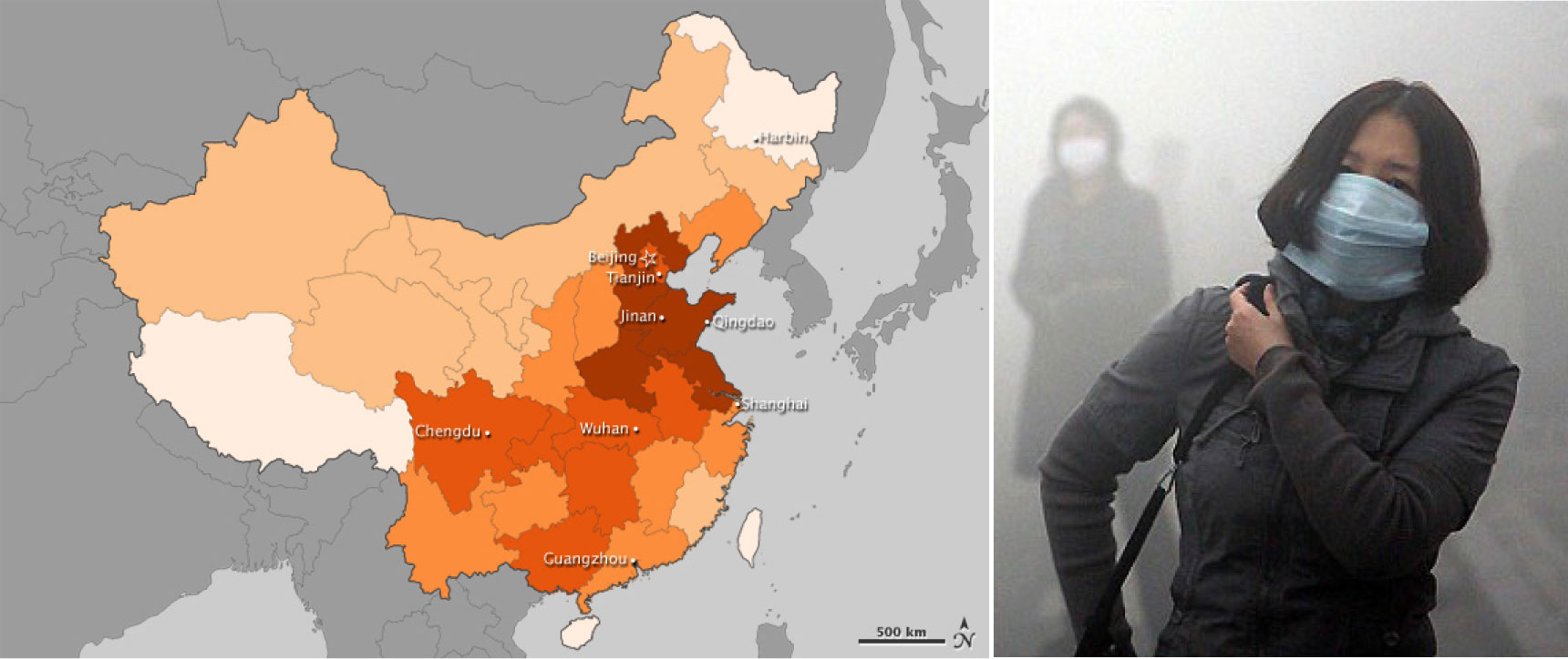
Note: the darker the color, the more heavily polluted air quality is.
Public Concerns
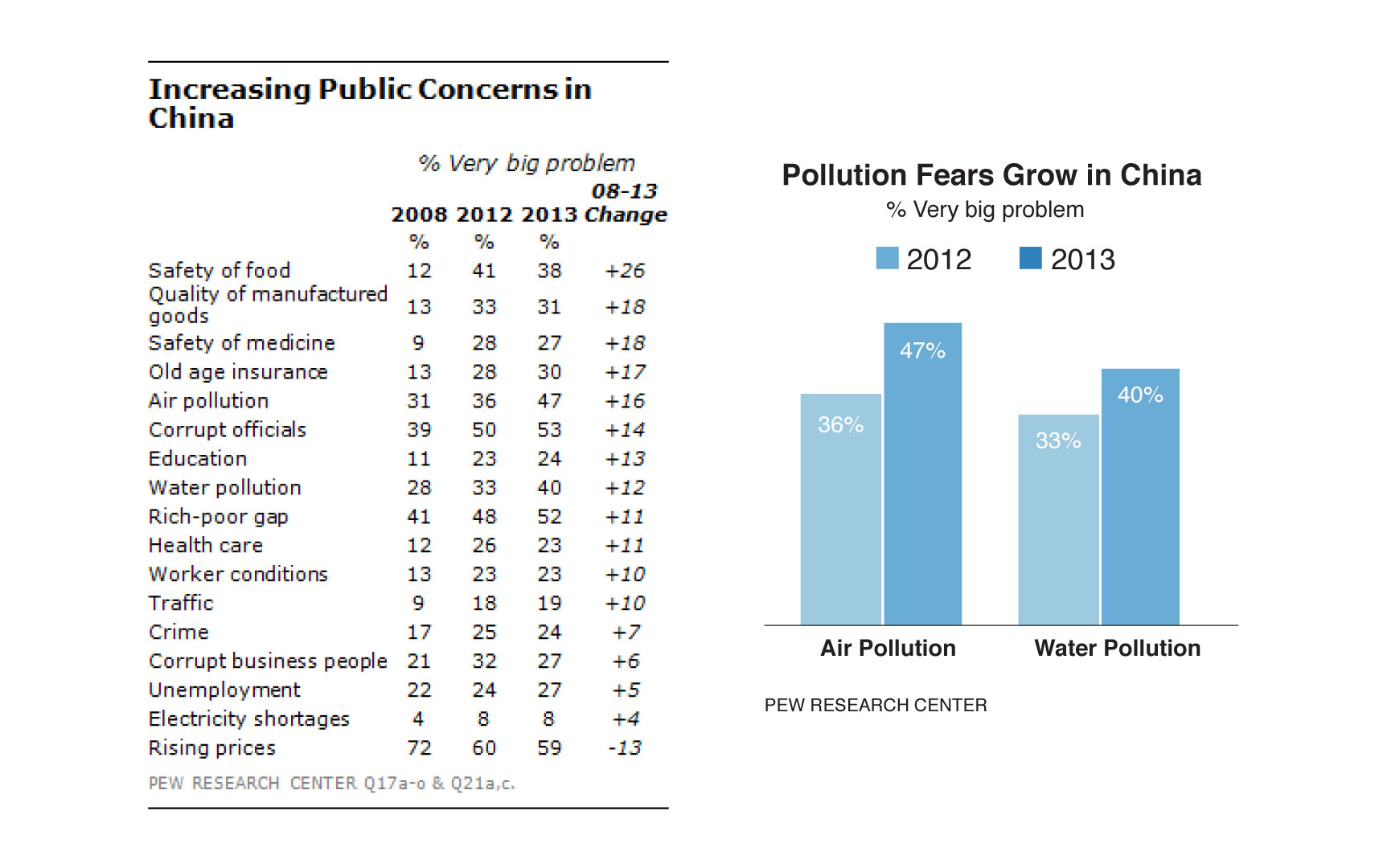
The Chinese public has high expectations for the country’s economy. In the short term, 80% said they expect the national economic situation to improve in next 12 months, the highest percentage among 39 countries polled by Pew Research in spring 2013. And in the long run, 82% believe that when Chinese children grow up, they will be better off than their parents – again, the highest percentage registered in the survey (Pew Research Center, 2013).
However, this optimism coexists with a growing set of concerns. Among the 17 issues included in the survey by Pew Research, eleven are considered either a very big or moderately big problem by at least 70% of respondents. Three issues are rated as a very big problem by more than half of those polled.
Just since last year, there have been significant changes in views about the environment. In January, air quality in Beijing and several other major cities reached record lows, and the public is increasingly taking note of this issue. Nearly half (47%) rate air pollution a very big problem, an increase of 11 percentage points from 2012.
Competitive Product Analysis
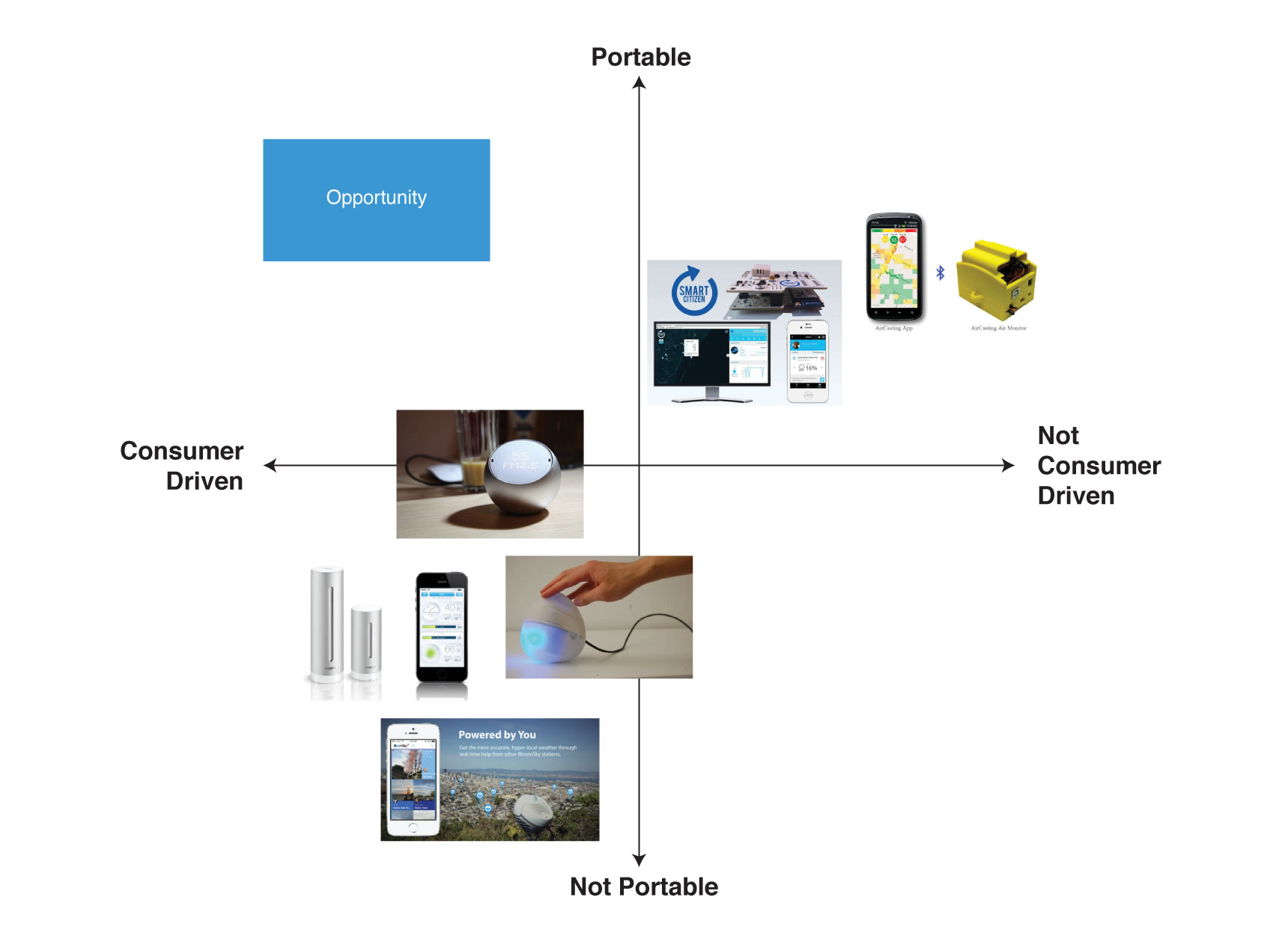
Portable means the device can be carried around with users to detect air quality data in real time. Consumer driven means the product can provide the best experience to the carriers.
Most of the existing products in the market fall into two categories: portable, not consumer drive or consumer driven, not portable. For example, smart citizen is a well engineered product with both mobile app and web platform, but it is targeting the technologist who can assemble the device by themselves. Not many normal people want to do that. On the other hand, weather station is well designed focus on user experience, but both their outdoor and indoor device are not portable. So there is an opportunity at the upleft blue area of the chart for portable and consumer driven air quality detector.
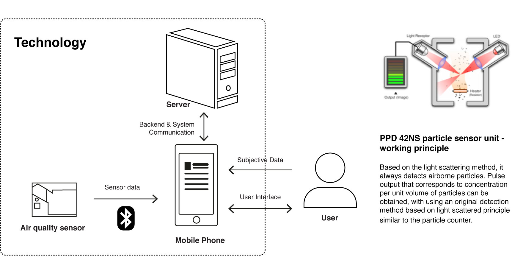
Technology Analysis
- The air quality sensor detects surrounding air quality and send the data to a mobile app wirelessly through Low Energy Bluetooth, where user can access more detailed AQI information on the mobile app.
- Considering users' privacy, it's completely their choices to send the collected data to the server or not or to what degree they want to share their data.
- If user agrees to share the data, the app will be collecting air quality data according to their commuting routes.
- Once the server receives the shared data from users, it does some algorithmic calculations and push end results to the mobile app where the data will be visualized.
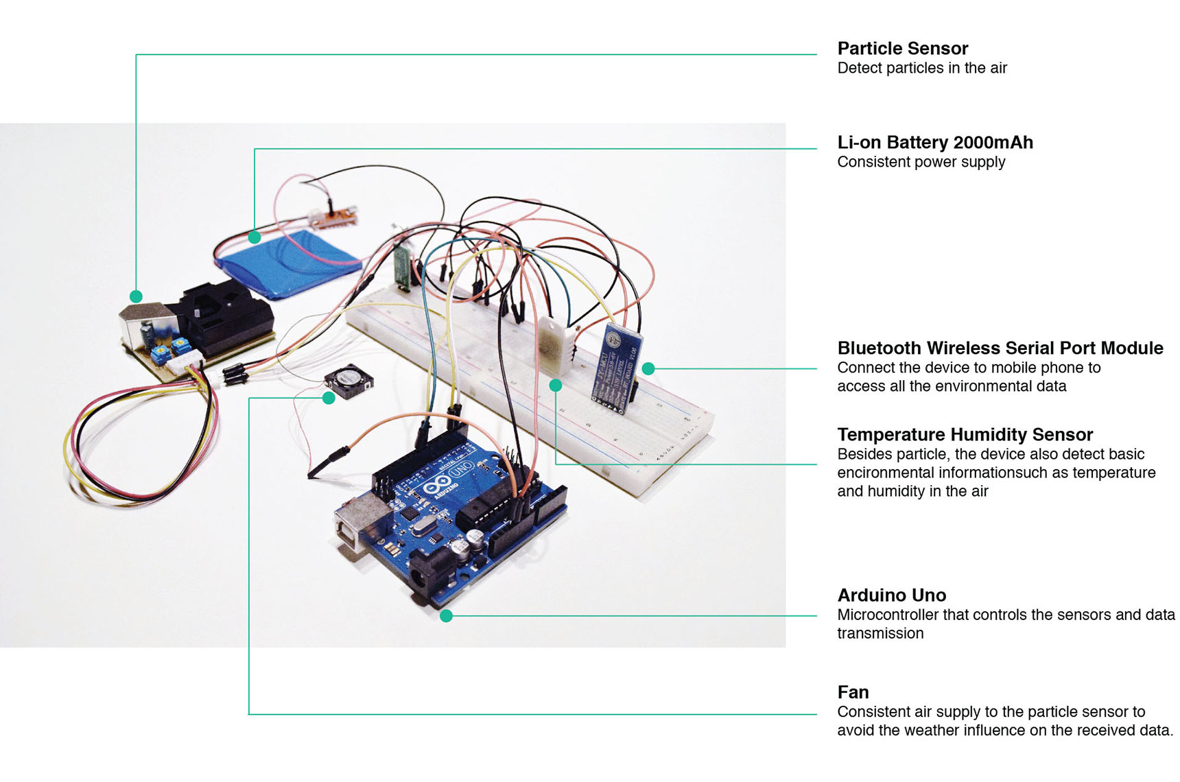
Arduino Prototype
Arduino prototype was made to evaluate the feasiblity of this project from technology perspective. After the experementation, I realized it's definitely feasible to develop such product with existing sensor and computing capabilities.
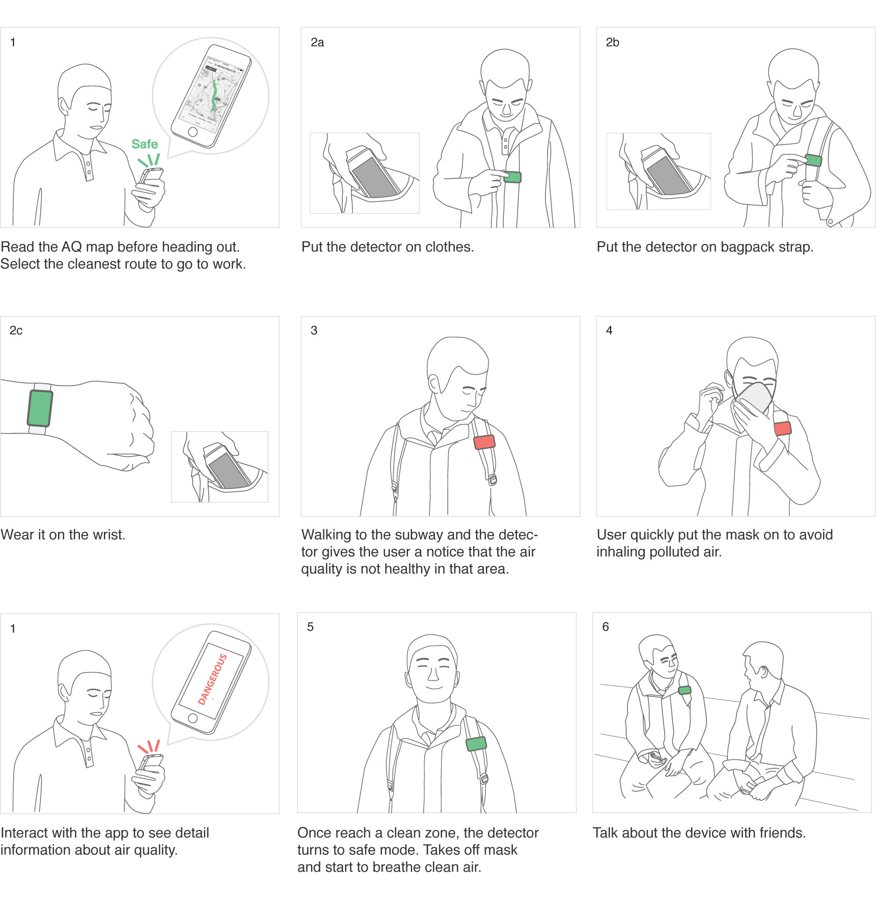
Story Board
Story board was created to explore possible use cases, provide a visual way to think about the whole experience and prepare for later prototyping and user research.
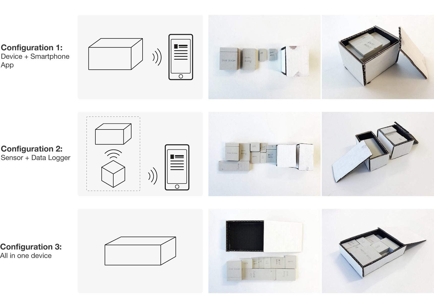
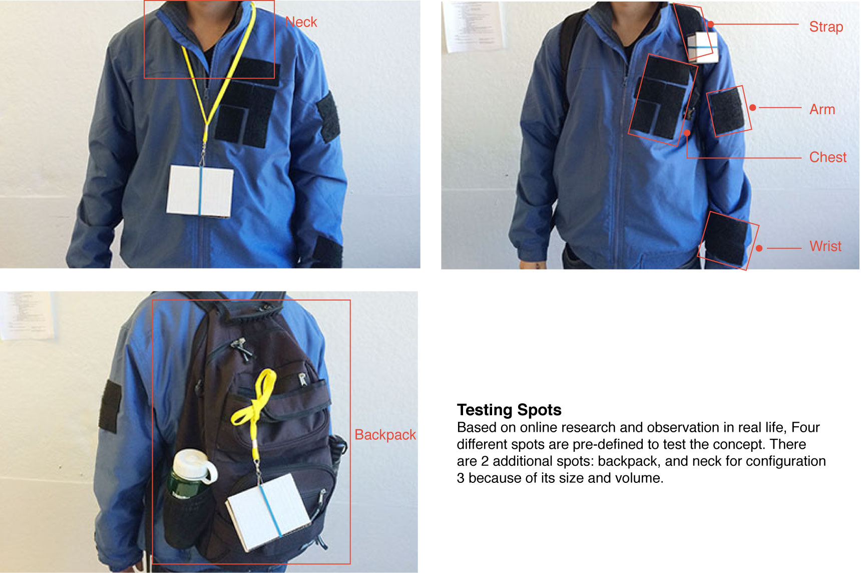
Block Model
Based on initial arduino prototyping, research of essential electronic components size such as Micro-Controller, Bluetooth Low Energy, Battery and etc. and existing products analysis, three different volume model configurations were made accordingly for later design experts test to collect feedback. With design experts feedback and data, one direction will be decided for further development.
Design Experts Test
There are in total eight participants completed the test, questionnaire and provided their feedback. Those experts are from research, design, engineering background, all of which have experienced the heavily polluted environment in China or have enough knowledge of this issue to understand the context.
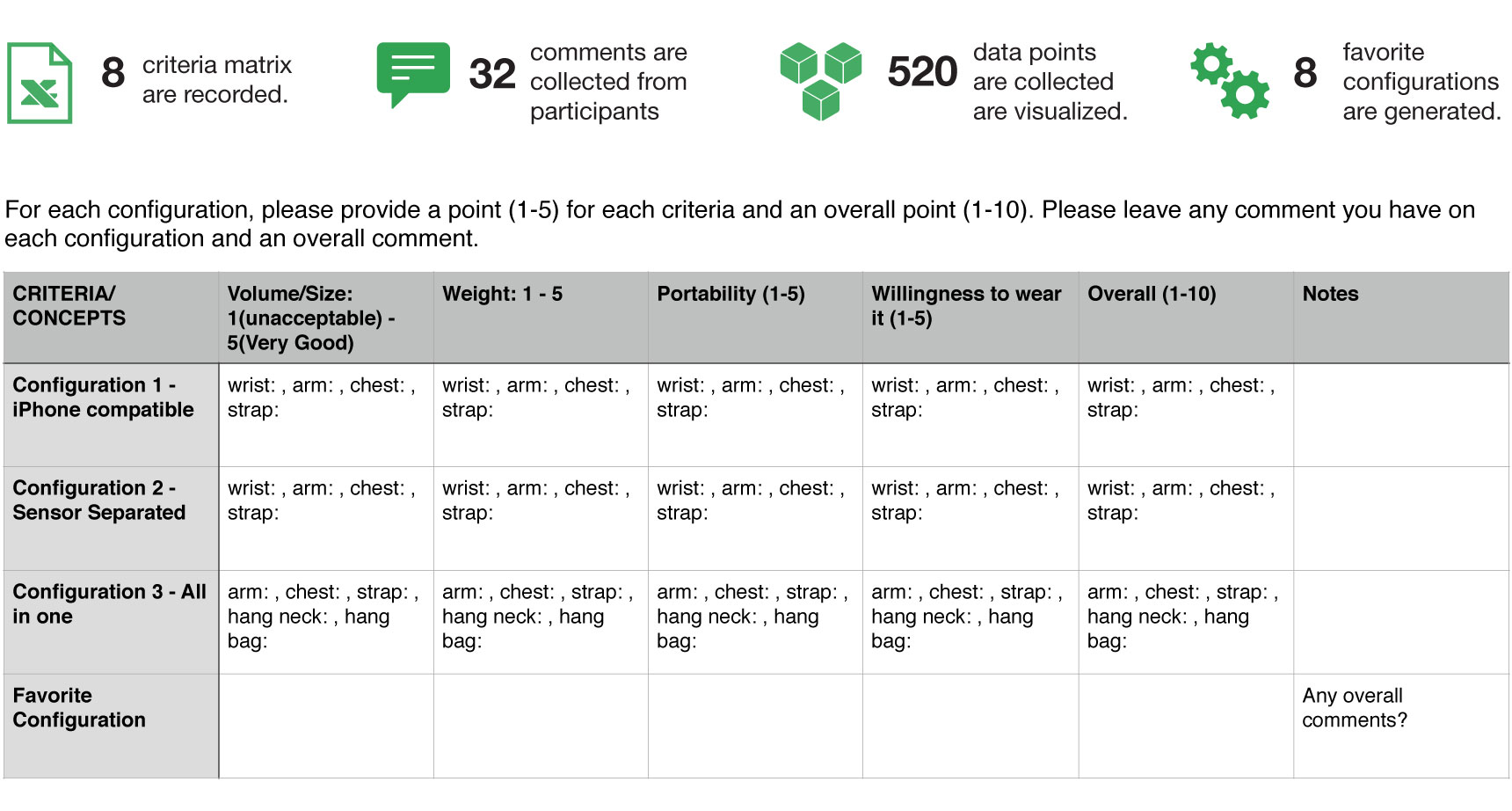
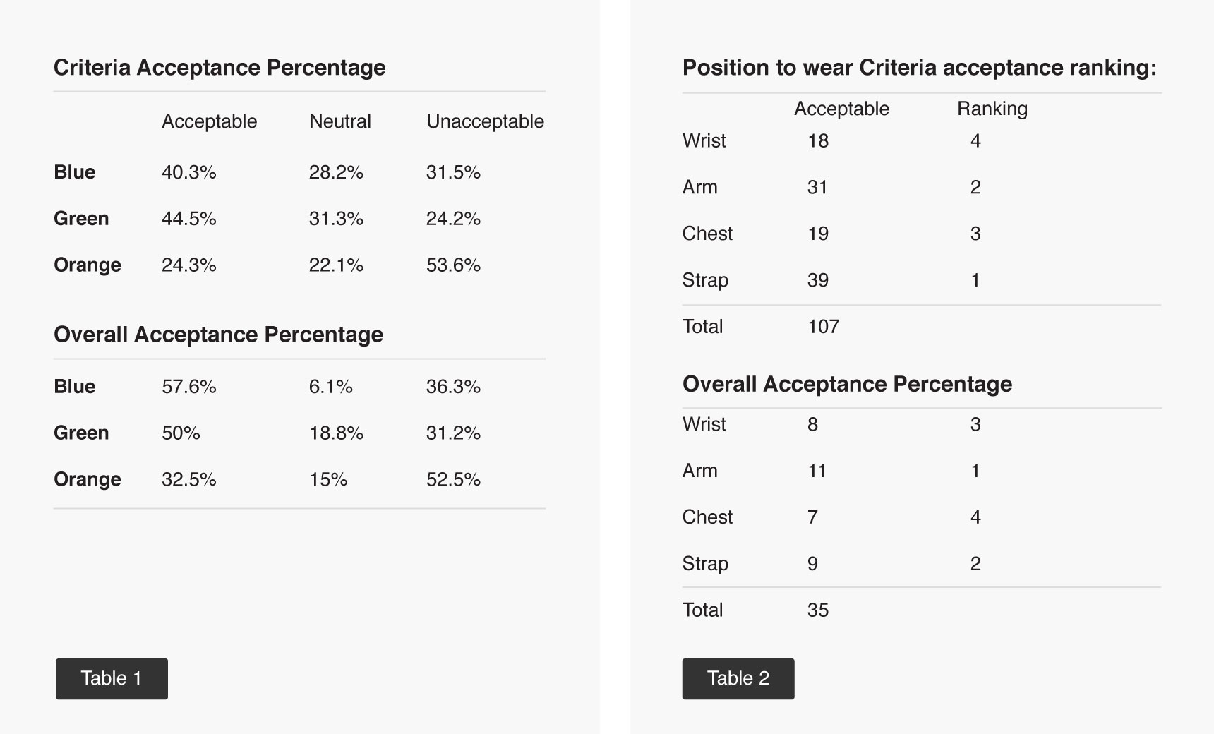
Data Collection Method and Criteria Matrix
Every design expert participants is required to finish a criteria matrix after they test each concept configuration. All the criteria has a scale from 1-5. 1 means strongly unacceptable; 5 means strongly acceptable. Total acceptance level has a scale of 1-10. 1 means strongly unacceptable; 10 means strongly acceptable. Above is the criteria matrix used for user research.
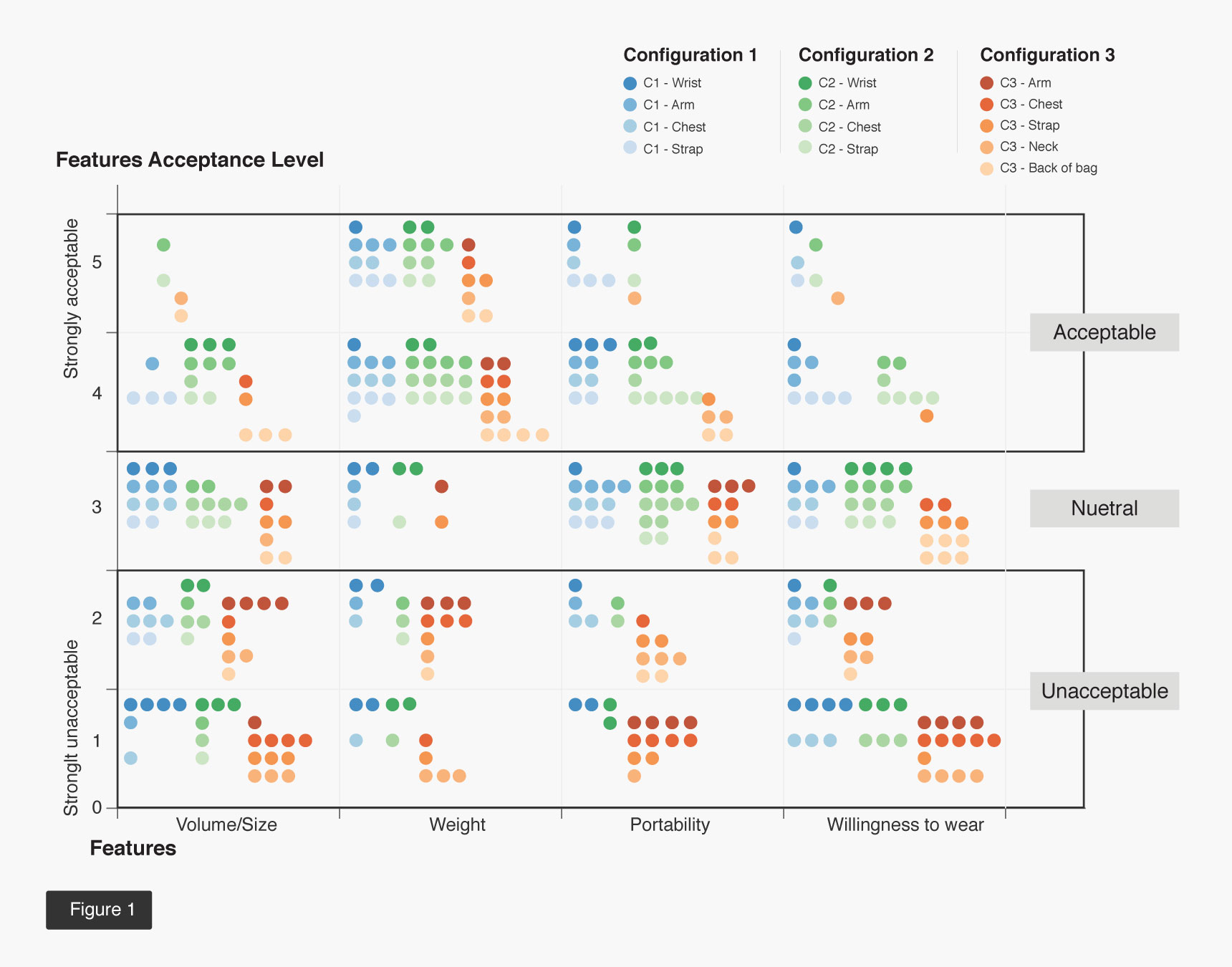
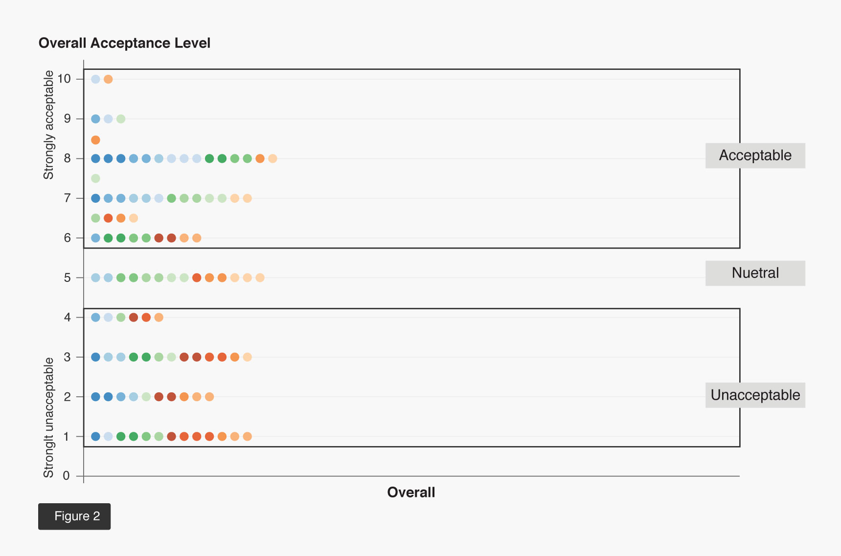
Every point collected in the criteria matrix represents a data point in the graph below. Each main theme color represent a configuration. Blue - Configuration 1, green - configuration 2, Orange - configuration 2. Different shade of the same color stands for different wearing spots. All 585 data points collected are visualized in the map below.
Data Analysis
Analysis 1: Acceptable and Unacceptable Configuration.
As seen from Figure 1, there are more green and blue colors above the neutral line (3 point) than orange colors. Most orange colors are actually below that line. In figure 2, the overall acceptance graph has a similar result. If we take a look at table 1, blue and green both have a higher acceptable percentage than unacceptable while orange is the opposite. That leads to an assumption that C1 and C2 acceptable while C3 is unacceptable.
Analysis 2: Most Acceptable Configuration.
While comparing blue to green, even though blue has 12.3% less data points than green in the criteria acceptance graph. Blue has 15.8% more than green in the overall acceptance graph. That leads to an assumption that even though the smaller size and volume of the exposed part in configuration 2 help it reach a higher acceptance level based on different features, the overall experience is not as good as configuration 1.
Analysis 3: Criteria.
One thing worth noticing is that orange colors in Figure 1 above the neutral line are mainly in the weight column. Also, most of the blues and greens in the weight column are above 3. That leads to an assumption that participants don’t mind weight much as long as it’s within the acceptance range. If we look at the unacceptable section in Figure 1 horizontally, volume/size column has the most data points, that means participants has a high standard for volume and size for a wearable product, which might lead to a medium acceptance level.
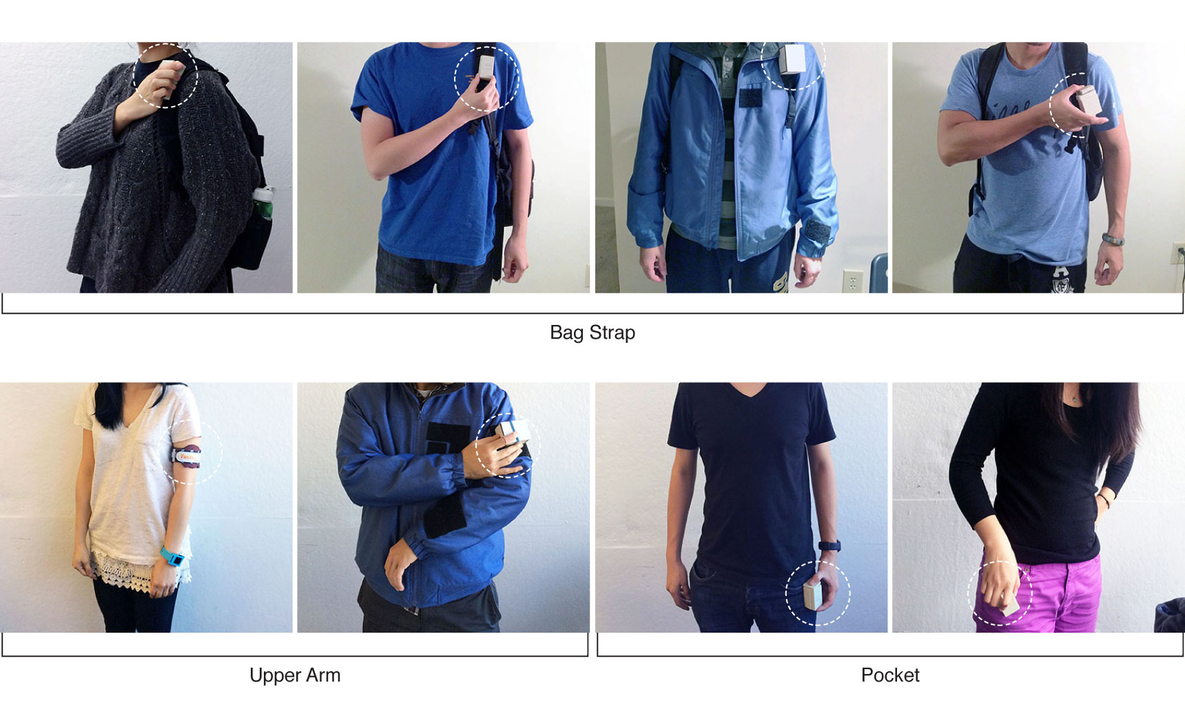
Analysis 4: Position to Wear.
When calculating the acceptance percentage of position to wear, Configuration 3 is removed for calculation because previous result revealed that C3 is unacceptable for participants. Removing it from the calculation will improve the accuracy of the result. Based on calculation result. Strap and arm are the top two in criteria acceptance and overall acceptance ranking. That means those two positions have a lot of potential to explore in terms of positions to wear the device.
Most Preferred Configurations
Most preferred configurations are chosen by participants and compared to decided which one configuration is overall preferred and provide the best user experience.
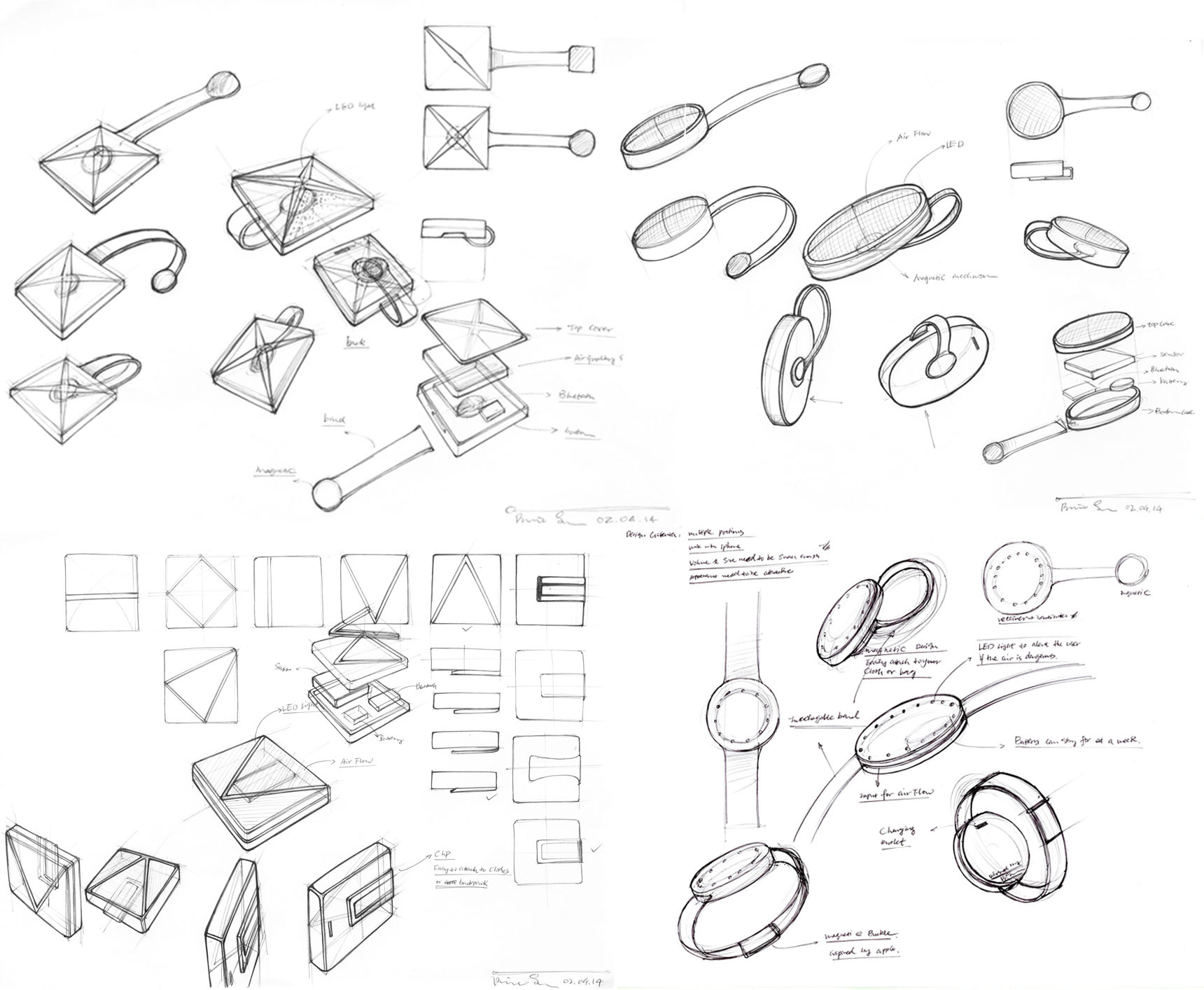
Physical Device - Sketch
In the sketching section, you can see I started to explore freely at the beginning with very basic forms: round, square, triangle, rectangle, etc. Some of the exploration follows the theme of “mimic nature". Based on the refined design criteria that the device needs to be wore on different body parts. A range of attachment methods such as clip, band and magnetic are sketched out to understand how they would work to meet criteria. The final result is a mix of natural form and flexible attachment methods. It has a simple form with interesting design elements and a easy to use attachment mechanism. The three refined concepts are continued to be developed later with CAD model and physical mockups.
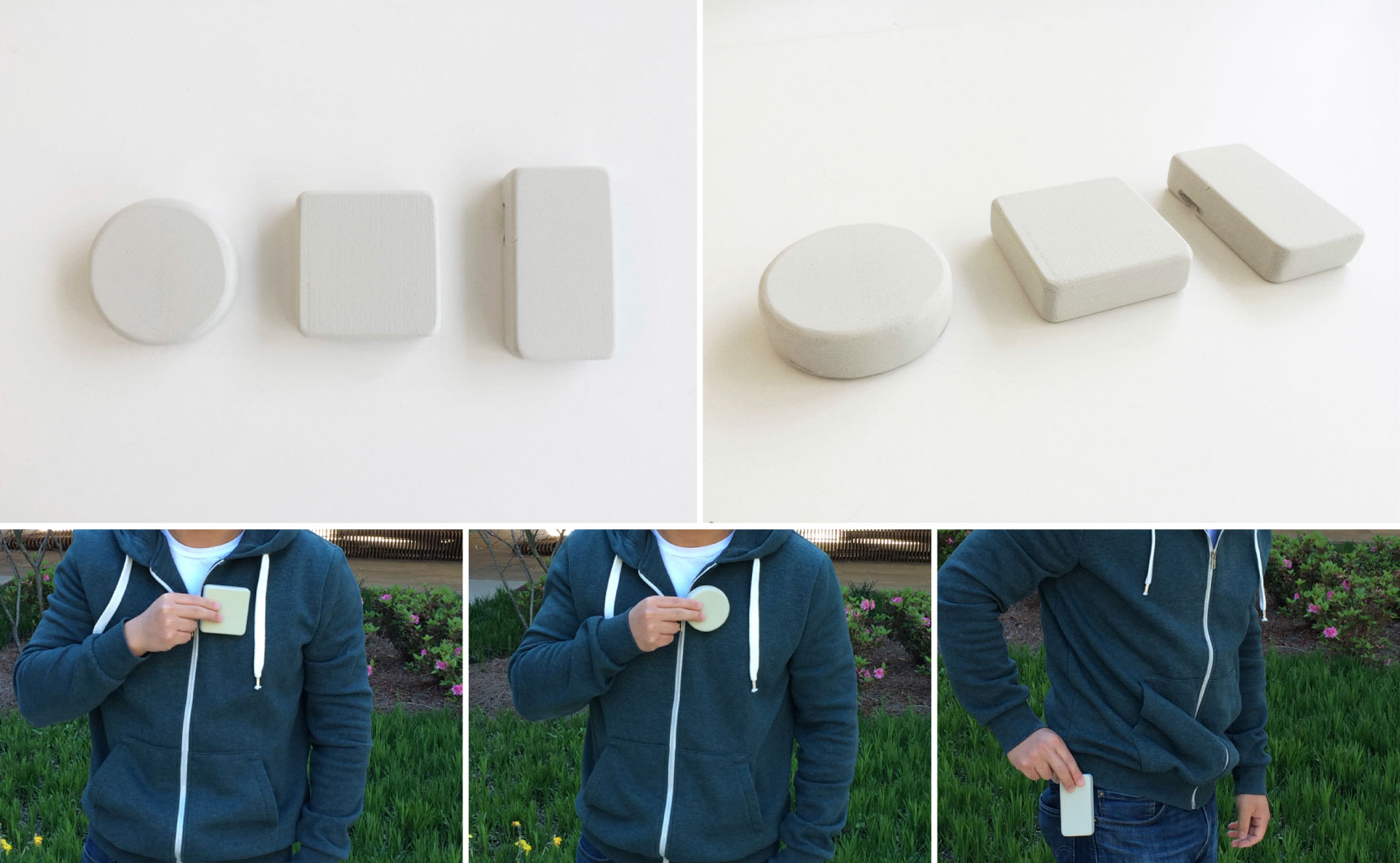
Note: foam model is quickly made to test the proportion
Physical Device - Foam Model
Foam models are quickly made to test how the volume and size feel in use. The original size of the foam model is fully driven by the internal Arduino components sizes. It turns out to be big and feel intrusive to wear. After consulting with engineers, it was determined the internal components could be shrink approximately 35%. I decide to go with the production level sensor to make the size small and enjoyable to wear. The foam model also help me to have conversations with different people to get more feedback on the device prototype for further development.
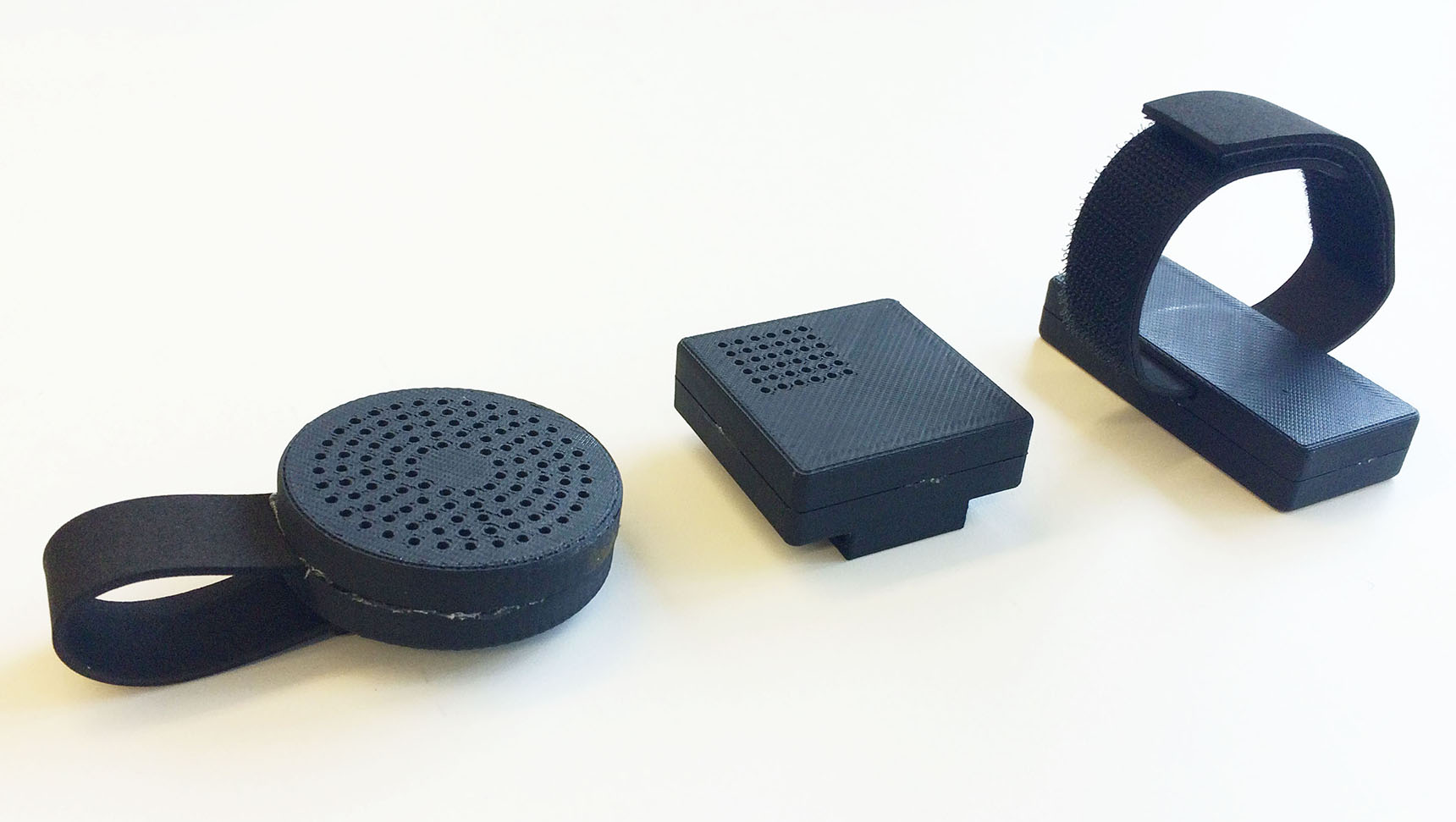

Note: those prototypes can be weared in multiple ways. Those pictures are only showing one use case for each variation.
Physical Device - Modeling and 3D Print
The first iteration of 3D print is made with a rough 3D printer to check how the volume and size feel and how all the details fit in with the overall design. A second round of 3D print is conducted with a more precise printer and all the attachment methods are also prototyped for later usability testing. Weight is added inside the prototype to make it feel more like a real device.
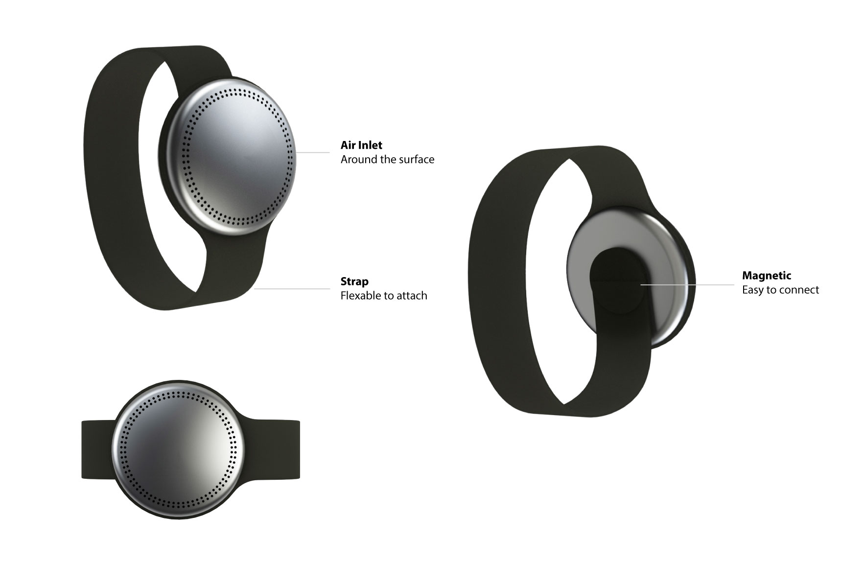
Physical Device - Final Renderings
Final renderings were created to decide the final look and feel of the physical device.
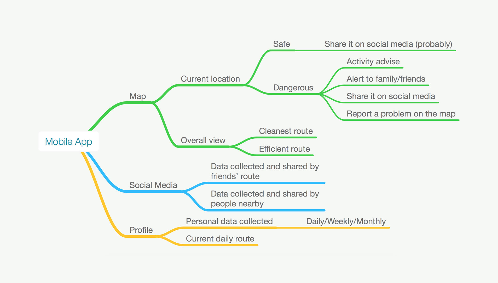
Digital Interface - Mind Mapping
Mind mapping is created to figure out how the information architecture of the mobile app is. What are the essential content of this app and what is the best way to present them in a sensible hierarchy. Once that's decided, I moved on to sketching and wireframing.
Digital Interface - Wireframe
Wireframe is made to quickly decided what is the visual method to present the information hierarchy. It allows me to explore different possible directions and figure out the best one. Metric, charts, map, etc. are added to make the app more engaging and intuitive to use.
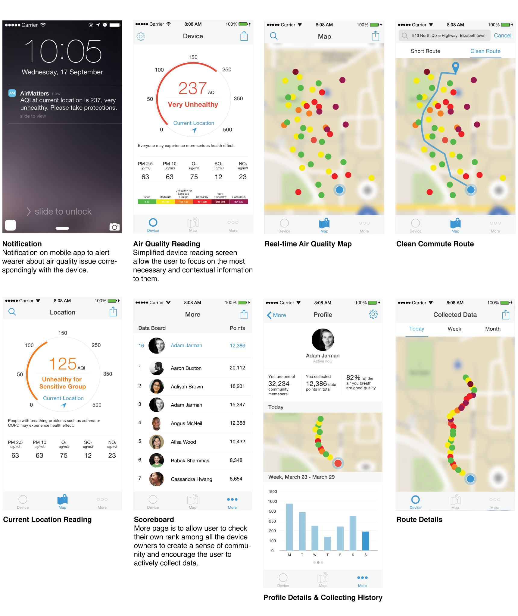
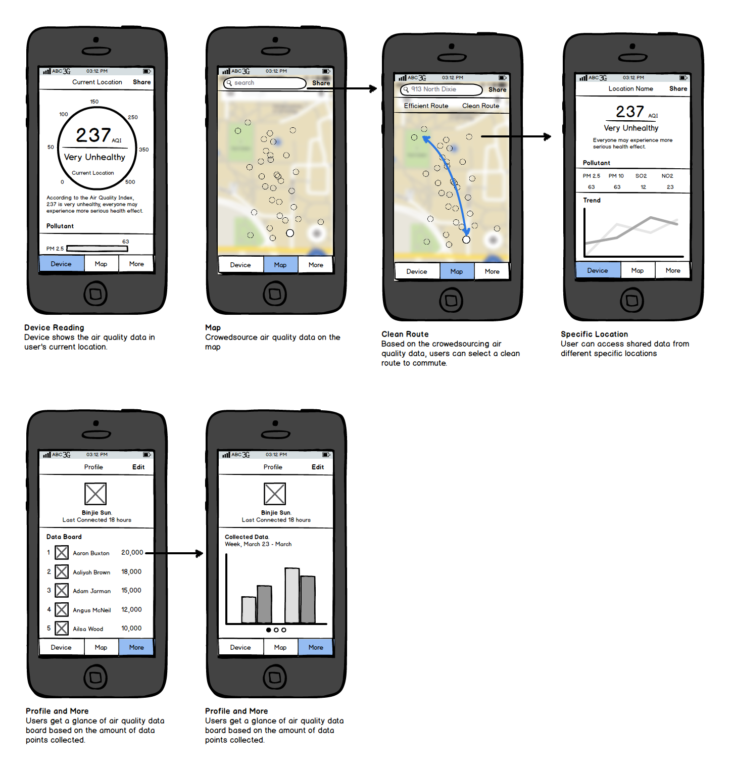
Digital Interface - Final UI
With all the foudations built previously, the final UI is another layer on top. It is showing more depth into some details and allows me to think about feasiblity from an implementation point of view. Two of the most important features are current reading in real time and scoreboard. Realtime readings make sure users are aware of their surrounding environment and may take neccessary actions. Scoreboard allows users to have a sense of community while dealing with such serious issues.
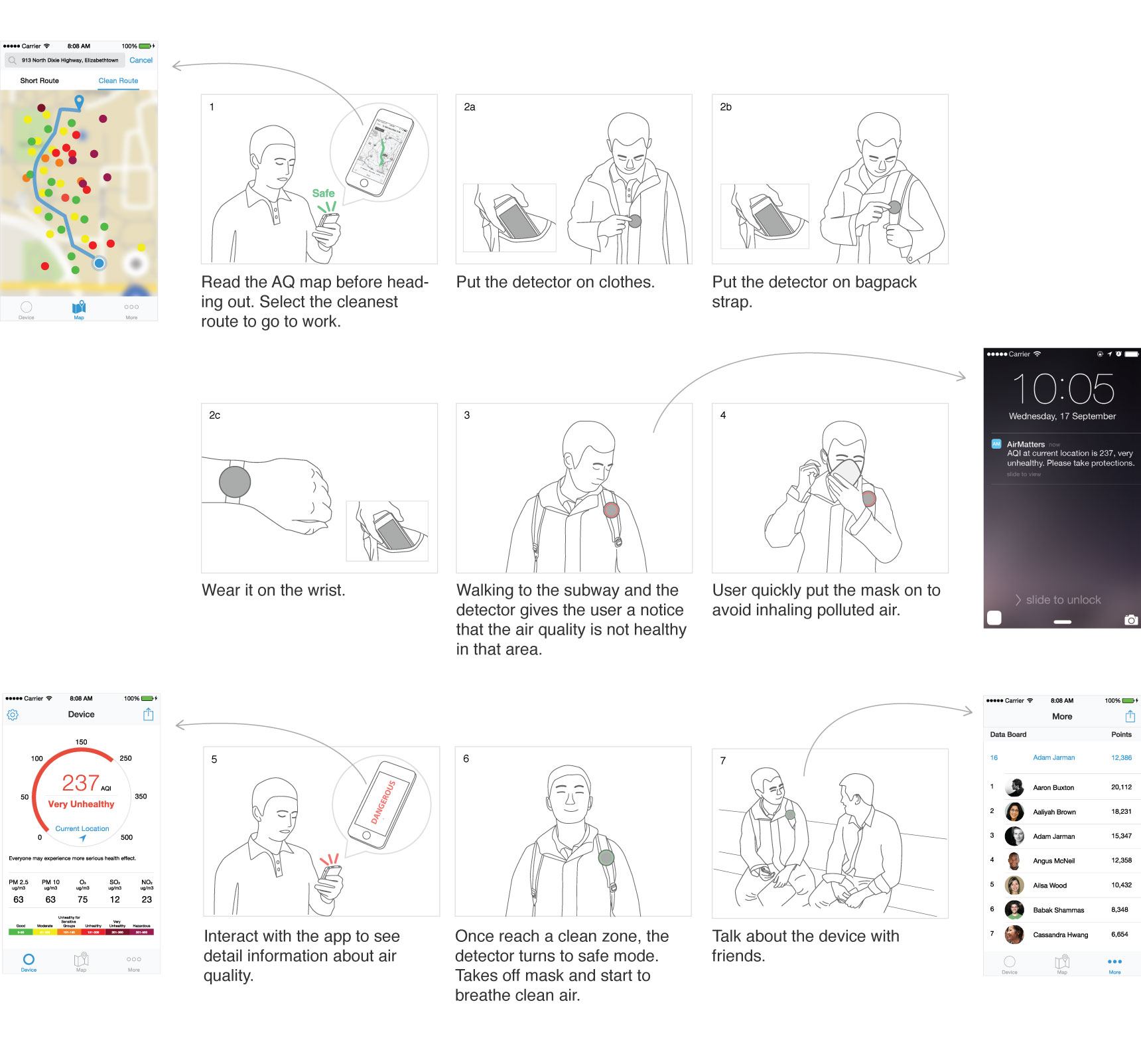
Use Case Scenarios
The final use case scenarios shows how the physical device and digital interface can be used together to navigate users through air quality issues with a great experience.
Note: After both prototypes for physical device and digital interface are made and refined, there was actually another around of usability test that dives even deeper into user-centric and data driven design process. If you are interested to see more, let me know.